


Okay, so first order of news.
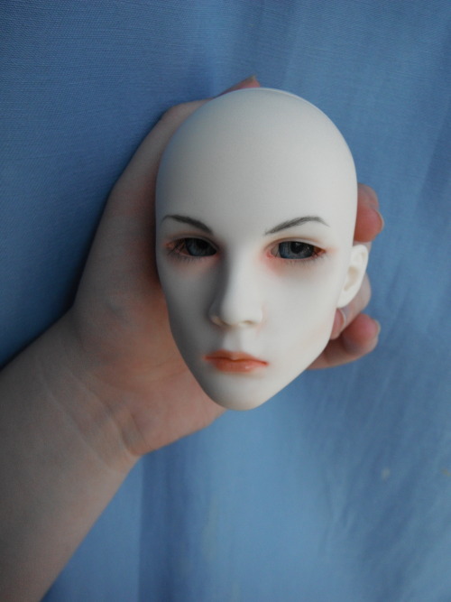
The other day, I painted my friend's new Dollshe Saint head. I've never worked with the sculpt before, but it was interesting. He's the old version head (she got him during the sale Dollshe ran before discontinuing them) in their Fresh tone. He's supposed to be a grumpy guy. I'm hoping she'll like it, but she hasn't been online today to see the pictures yet.
It's just something simple, but the character doesn't call for anything too complex. His sculpt is so intensely angular, I didn't want to go too far with any contouring. Here's to hoping that this translates into "natural" and "masculine". I find that it's easier to do girly faceups, but hopefully someday I will be able to pull off the "manly man" look without going overboard on facial hair.
Also. I got tired of the orange-on-gray-on-black theme. It looked really "blah" and it made it hard to imagine anyone would want to stick around to read something so generic. Maybe I went a little overboard, but it was really fun to play around with different colors. I'm very into bright colors. If you like it, let me know. If not, well, let me know, too. I'm open to suggestions.
~~Aronzo~~
You did great and you know it. OuO
ReplyDeleteAlso, I'd change the yellow font, it gets hard to read and light-on-light color is a sharp/stark look that detracts attention from the more important text of your posts towards the bottom of the screen. Otherwise, your theme is fine.
You did great and you know it. OuO
ReplyDeleteAlso, I'd change the yellow font, it gets hard to read and light-on-light color is a sharp/stark look that detracts attention from the more important text of your posts towards the bottom of the screen. Otherwise, your theme is fine.
All right, maybe red looks better. Hi, by the way!
Delete